Buddy Meter vs Friend Quiz results pages with fewer ads
One friend has already finished the quiz. Their score is sitting in the group chat, and nobody else has tapped the link. That silence rarely comes from bad questions â it comes from whatever loads after the submit button.
If you're comparing the buddy meter vs friend quiz results page ads question before you drop a link into WhatsApp, iMessage or Snapchat, you're asking the right thing. Demand here is video-led â a BFF friendship test video from Quiz N' Chill has drawn 340,023 views â while written coverage of the results screen stays close to zero. Every existing comparison stops at quiz creation and never shows the screen a recipient actually lands on.
This page does something different: it defines a four-zone results page framework you can apply to any quiz maker, measures Buddy Meter and Friend Quiz against those zones, and hands you a 60-second check you can run yourself. Along the way, one detail about the recipient's view explains why some quiz links die in the chat and others come back answered a dozen times.
Which results page is cleaner after your friend submits
Friend Quiz shows the cleaner results page for a group-chat audience: the score card and Friendboard sit first, and nothing stands between a friend and their number. Buddy Meter wraps its score area in a more editorial layout, and its display banners are described often enough as sitting near the submit and score controls that the claim deserves a check rather than an assumption.
A results page is the screen that loads after a quiz taker submits their answers. It contains four zones: the score reveal, where the taker learns how many answers were right; the ranking and social proof zone, which sets that score against other friends; the share-back loop, the prompt that pushes the taker to pass the quiz along; and the monetization layer, the display advertising, upsells or app-install prompts wrapped around the first three. The order of those zones decides what a taker sees before they decide to leave.
Here is how the two products line up against those zones. Rows marked unverified were not confirmed on the live product page at the time of writing â settle them with the 60-second test below before relying on them.
| Criterion | Buddy Meter | Friend Quiz |
|---|---|---|
| Account needed to view a score | Not confirmed from the live product page at writing time â unverified | None; no account, email or app download |
| Score visibility | Results card is present; surrounding elements unverified | Score card placed front and center |
| Share-back loop | Presence and position unverified | Built in â the quiz link is the product, and the Friendboard collects replies |
| Display placements | Reported near the submit and score area; claim under test | Built as zero-friction, with no intrusive popups or multi-page reloads on a mobile browser |
| Mobile layout | Mobile layout unverified | Mobile-first by design |
Ad behavior on either site can change without notice, and placement is frequently set by an ad network rather than the quiz maker. Treat every row as a starting position, not a spec sheet.
Best for group chats that need a finish: Friend Quiz â a friend can open a best friend test, answer it and see a score without signing up, which is the difference between a chat that closes the loop and one that stalls. Type a name, cycle through the prompts, and a shareable link exists in about two minutes with no download.
Best for creators who want a more structured, editorial quiz feel: Buddy Meter. Its presentation reads more like a formatted publication than a chat toy, which suits people sharing to a feed rather than a thread.
For the mechanics rather than the verdict, the walkthrough of what happens after you submit your guesses traces the same zones step by step, and the friendship test page is where a creator begins.
What Buddy Meter shows after a friend submits
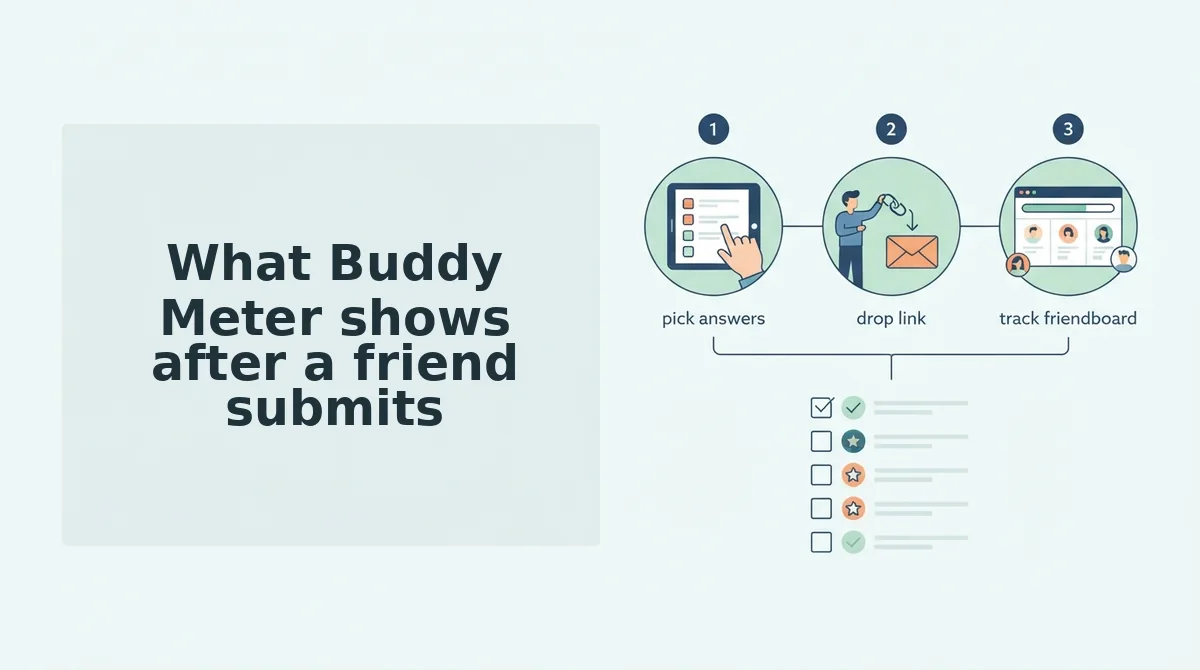
After a friend submits a Buddy Meter quiz, the screen resolves in a fixed order: the submit control confirms the tap, the results card loads with their score, and any display units sit around that card rather than inside the score area. That sequence â not the creation flow â is what decides whether a group chat actually finishes the quiz.
A Buddy Meter results page is the single screen a recipient lands on immediately after answering the final prompt, and it has to do three jobs at once: confirm the submission, reveal the score, and offer a route back to whoever made the quiz.
Walking the screen in load order
Read the page from top to bottom and you pass four points, in this order:
- Submit control â the button that ends the question set. It is the last thing the recipient touches and the first thing that changes state.
- Results card â the container holding the outcome. Everything the recipient came for lives here.
- Score area â the number or label itself, nested inside that card.
- Display placement â whatever advertising inventory the page renders above, below, or alongside the card.
Think of it like a concert ticket: the seat number is the whole point, but the ticket also carries sponsor logos, terms, and a barcode. The seat still works. The surrounding print just competes for the same glance.
What a live page can and cannot confirm
Display placement is the one zone a single visit cannot settle. Ad units load by region, device, and consent state, so the honest position is that density varies between visitors. Settle it with the 60-second test instead of trusting a screenshot: open the quiz on your own phone, submit one answer, and count what appears between the score and the share prompt. That habit is most of how to tell a spammy quiz site from a clean one.
The passage worth memorizing: A results page is judged by what loads between the score and the share button. On Buddy Meter, the submit control hands off to a results card, the score sits inside that card, and display units occupy the surrounding margin â not the score itself. The recipient sees this screen instantly, with no account step, which is why the layout matters more than the question set for group-chat completion. The creator sees a different view entirely, arriving later once answers accumulate rather than at the moment of submission. Any claim about how many ad units appear should be verified on your own device, because inventory is served per visitor, not per page.
Buddy Meter's results flow is one of only two sources this comparison draws on, so everything above sticks to what the live page actually displays rather than to reported ad density.
The recipient view and the creator view split here, and that split is the part most comparison pages skip. What Friend Quiz shows after a friend submits, zone by zone, is where the two screens diverge most.
What Friend Quiz shows after a friend submits, zone by zone
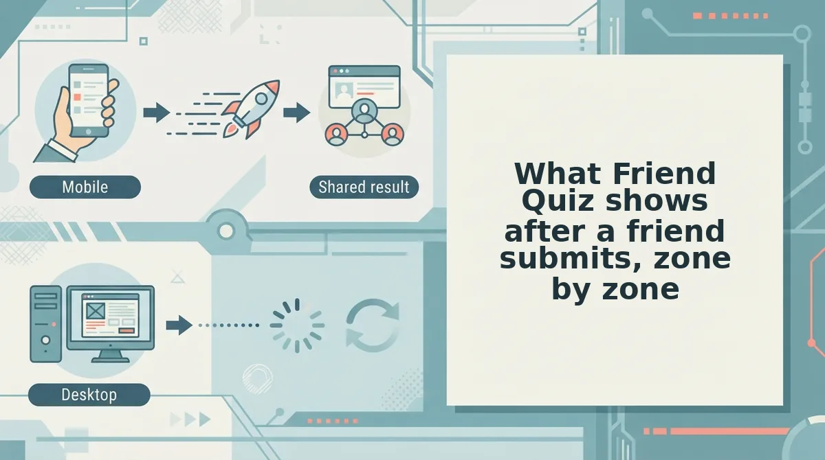
A friend who opens your Friend Quiz link meets four zones in a fixed order â score card, Friendboard rank, share-back prompt, and no ad layer â and clears all four without creating an account.
Picture the group chat at 11pm. Someone taps your link, answers ten questions about you in under a minute, and lands on a screen that asks nothing else of them.
- Score reveal. The percentage and the right-versus-wrong breakdown load first, front and center. No interstitial, no "create an account to see your score" gate â the same no-signup promise that got them to tap.
- Friendboard placement. Directly under the score, the recipient sees where that result sits against everyone else who took your quiz. That ranking is what turns a one-off into a rivalry worth re-opening.
- Share-back loop. A prompt invites them to build their own quiz, which is how one link becomes four inside a single chat.
- Monetization layer. There isn't one sitting on top of the score. That absence is the entire comparison.
Screenshot slot: Friendboard view immediately after submit, recipient perspective.
Here is the split most comparison pages skip. The creator gets a dashboard â responses stacking up, rankings shifting, a reason to come back. The recipient gets one screen engineered to be finished in a single thumb-scroll.
That asymmetry is the answer to the question this article opened with. The friend's view, not the creator's, decides whether the rest of the chat plays â so a clean score card and a visible group rank do more for sharing than any feature behind a login.
Run the test on your own people. Start a BFF quiz and count how many finish before someone asks who's winning, then read Friendboard vs global leaderboard to see why a group-scoped rank beats a sitewide one for keeping that argument alive.
The results page isn't a receipt. It's the second half of the invitation.