Buddy Meter vs Friend Quiz ad clutter on a phone screen
A link lands in the group chat. Someone taps it one-handed, mid-conversation, and whatever fills that first screen decides whether they ever reach question one. That is where the buddy meter vs friend quiz comparison actually gets settled â not on a feature list, but in the few seconds between the tap and the first prompt.
You have probably watched it happen: you shared a quiz, a friend opened it, and then went quiet. Not bored â buried.
This guide hands you a way to judge that for yourself instead of taking anyone's word for it. You will get a three-zone screen budget you can score on your own phone, a numbered walkthrough of what a Buddy Meter link opens, and a look at the one structural detail that shapes every screen after the tap. Watch the link format as you read â a Buddy Meter quiz arrives as a single URL of the shape buddymeter.com/quiz.html?q=... that gives the tapper no preview of what comes next, and the YouTube descriptions creators post with those quizzes are usually bare links with no warning about what the page shows first.
Friend Quiz takes the other route entirely: it runs in the mobile browser from enter-name to share-link, with no download, no account, and no email step, so the trivia is the first thing a friend meets.
Which One Is Less Cluttered on a Phone Screen?
Friend Quiz is the lighter of the two on a phone screen, because its flow goes from typing a name to holding a shareable link inside a mobile browser with no install, account, or email step. Buddy Meter's shared quiz pages carry more surrounding content around the same trivia format.
The short answer: Friend Quiz keeps the first screen closer to the question, while Buddy Meter wraps its prompts in more page furniture. Score both yourself with the three-zone method below rather than trusting a count that goes stale after the next redesign.
One caveat up front: ad density on any free quiz page varies by page, by device, and by traffic source. Treat what follows as a framework, not a measured benchmark.
| Screen zone | What you are judging | Score 0 | Score 2 |
|---|---|---|---|
| Above the fold | What appears before you scroll | The question is pushed off-screen | The question is the first thing visible |
| Between prompts | What sits beside the question you are answering | An interruption between every answer | A clean question with the next control obvious |
| Result screen | What surrounds the score you want to share | The share action is hard to find | Score and share button sit together |
Open both sites on your own phone and score each zone 0, 1, or 2. A total of 0â2 means a lean screen, 3â4 means mixed, and 5â6 means heavy. The number is yours, and it stays useful after either platform ships a redesign.
Buddy Meter earns real credit here: the format is already familiar to anyone who has answered one, the quiz library is large, and answering needs no account â which is why links circulate so easily in the first place. If your friends have answered a Buddy Meter quiz before, they will recognise the shape immediately.
Best for creators who want a link that feels instantly recognisable: Buddy Meter, because the format needs no explanation. Best for creators who want the question to be the first thing a friend sees: Friend Quiz, because the browser-only flow keeps the setup off the shared page. For a ready-made version of the second, use the best friend test and see how few taps sit between a name and a link.
Why do free quiz sites show so many ads? Because the creator builds the quiz on someone else's platform, and that platform monetises the traffic the creator brings to it. The shared link is the product being monetised, not the quiz itself. That single fact explains most of what sits between you and question one, and it is the reason a page can feel busy even when the trivia underneath is simple.
What You Actually See After Tapping a Buddy Meter Quiz Link
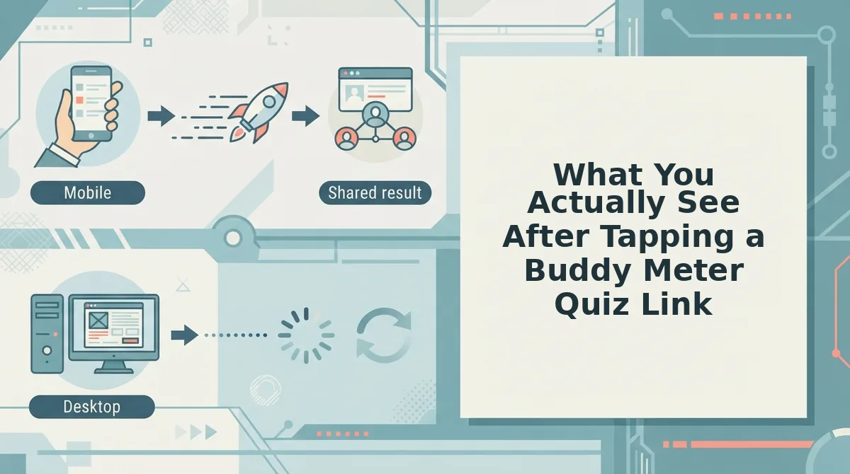
A Buddy Meter link opens straight onto the quiz page rather than a landing screen, and the whole experience â identity, prompts, answer reveal, result â lives inside that one URL. All you need is a phone browser and the shared link; there is nothing to install and no account to answer.
Shared links come in one shape, like buddymeter.com/quiz.html?q=K9fO8vn, a URL that appears in creator descriptions with no description of the page attached. Here is the sequence that link opens.
- Open the link in your phone's browser. Tap the URL in the chat instead of copying it. The quiz ID travels in the address, so the same link returns the same quiz every time.
- Wait for the page to establish the quiz identity (a few seconds). You should see the creator's name and the quiz title before any question appears. That block tells you whose quiz you opened.
- Read the first prompt and note what surrounds it. The question text sits below the identity block with tappable answer rows underneath. This is the moment to judge how much of the screen the question actually gets.
- Tap your answer. Selection advances you one prompt at a time rather than submitting the whole quiz at once, so nothing is scored until the sequence ends.
- Repeat through the remaining prompts. Allow roughly a minute; each step has the same shape â question, options, next.
- Read the answer reveal, then the result screen. You should see which answers were right and a final score you can compare against the creator's own answers.
The interruption points sit by design, not by accident: the page is monetised on the traffic the creator shared, which is why surrounding content appears before the first question and again as you move between prompts. For a closer look at that shared-screen experience, read what friends see when they tap your link.
The same tap on a Friend Quiz link produces a noticeably different sequence.
What You See After Tapping a Friend Quiz Link on the Same Phone
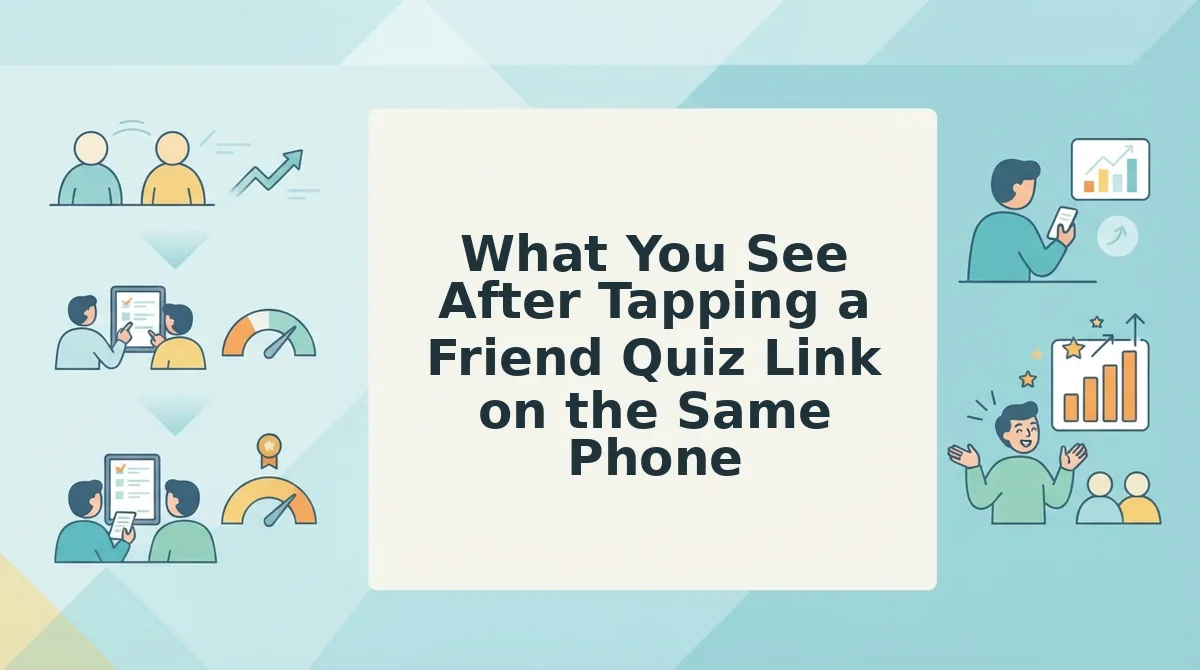
You will see the quiz load inside your mobile browser with no app install, no account prompt, and nothing sitting between the tap and the first question. The full run from link to result screen takes about two minutes on a phone.
Before you start: a phone with any mobile browser (Safari, Chrome, or the in-app browser inside WhatsApp or iMessage) and the quiz link from the chat. There is nothing to download and no account to create.
- Open the link. Tap the URL in the group chat. You should see the quiz load in the browser tab itself â not an app store page, an install banner, or a "open in app" interstitial.
- Type your name. Enter your name in the field at the top of the quiz, about 5 seconds. You should see it carried onto the quiz so the creator can tell who answered.
- Answer the prompt sequence. Read each prompt about the creator's habits, quirks, likes, and dislikes, then pick your answer one prompt at a time. You should see your progress advance with every tap; expect 60 to 90 seconds for a full set.
- Submit your answers. Tap your choice on the last prompt to close the sequence. You should see the answer reveal, with each prompt marked against what the creator actually picked.
- Read the result screen. Check your score and find the prompts you guessed wrong. You should see a clean count you can screenshot and drop straight back into the chat.
- Check the Friendboard. Open the real-time Friendboard tied to that quiz. You should see other friends' scores landing as they finish, which keeps the share loop running well after your own result is in.
The sequence lines up with the Buddy Meter walkthrough step for step â name, prompt sequence, answer reveal, result screen â which is what makes a side-by-side judgment possible at all. For the same flow framed around a closer friendship, see the BFF test.
Why Free Quiz Sites Show Ads and Why the Timing Beats the Count
An ad-supported quiz site is a free tool that pays for itself through the traffic each creator brings in, so the page has to earn before a visitor reaches the first question. That one fact explains both why the ads exist and why their placement matters more than their number.
Start with the business model, because there is nothing sinister in it. A creator builds a quiz at no cost and shares the link; every friend who taps it lands on a page the site owns, and no subscription covers that visit â so the visit itself becomes the inventory. Think of the free newspaper handed out at a train station: the paper costs you nothing because advertisers paid for the printing, and where those ads sit decides whether you keep reading.
Placement is therefore the thing worth judging. Interruptions fall into three types: pre-quiz interruptions block the tap before the first prompt loads, inter-prompt interruptions break the run between questions, and post-submit interruptions land between the answer reveal and the share. Each one damages a different step of the same short journey.
A count flattens that difference. Three interruptions at the wrong moment cost more than six spread where the reader already expects a pause â the way a single phone call during a punchline costs more than three between conversations.
Why do free quiz sites show so many ads? The short answer is that the quiz page, not the quiz, is the product. A creator makes a quiz at no cost and shares the link; the friends who tap it arrive on someone else's page, and that arrival is what gets monetised. Nothing about that is dishonest, but it does mean the site's incentive is to capture attention at the moment of highest intent â right before the first prompt. Once you know that, the useful question stops being the ad count and becomes the placement: does the interruption land before the tap, between prompts, or after the result?
If you would rather test placement than count banners, build a quiz, copy the single share link, and paste it into a chat â this Buddy Meter alternative walkthrough shows how the same three zones look when nothing sits between the tap and the first prompt.
When Buddy Meter Is the Better Pick and Where Friend Quiz Falls Short
Buddy Meter wins when you want a quiz library to browse or a format your friends already recognise. Friend Quiz wins when you want one link in a chat with nothing between the tap and the first prompt â and it genuinely loses on the cases below.
- You want a library to browse. Buddy Meter has an existing catalogue of quizzes you can take without building one first. That matters when you are in the mood to answer rather than create: you pick something and start, instead of waiting for a friend to send a link.
- Your friends already know the format. Familiarity is real value. A group that has played before reads the layout without explanation, so use it when the goal is a fast activity with zero onboarding talk.
- You need a catalogue of strangers' quizzes. Friend Quiz is built around one creator sharing one link, so there is no wall of other people's quizzes to browse for fun. If that browsing is the experience you want, this is not the tool for it.
- You want a native app. There is not one. Everything runs in the mobile browser, which is the point of the design and also its limit if you wanted an icon on your home screen.
- Run the 30-second field check. Open both links in two browser tabs and score four rows: time to first question, account required yes or no, when the first interruption lands, and whether you can answer straight from a chat link. Whichever wins three of four is your pick â the friendship test page shows what the no-account version looks like.
Once both flows are scored on the same four rows, the decision narrows to whichever link you would actually paste.
Which Link Should You Drop in the Group Chat?
Drop the Friend Quiz link â the tap you send is the tap every friend repeats, and it opens on a quiz screen instead of a pre-quiz banner stack. If your three-zone score landed around 5â6 to 3â4, that's the payoff the intro promised: the gap was never ad count, it was timing.
Strip the comparison down and all six sections point the same way. Clutter you scroll past costs a second; clutter that stands between a friend and the first question costs the quiz.
Your next move takes about two minutes:
- Type your name, answer the habit prompts, get a shareable quiz link.
- Drop that single link in WhatsApp, iMessage, or the group chat â no account wall on either side.
- Watch the Friendboard fill, then screenshot the leaderboard for the follow-up banter.
- Want a twist? The friendship dare quiz runs the same tap-to-result flow.
On a phone, the flow is the whole product â which is why the interruption timing, not the banner total, was the thing worth measuring.